BTRZ Tarot
Visual identity, product structure and digital experience for an independent tarot reader.
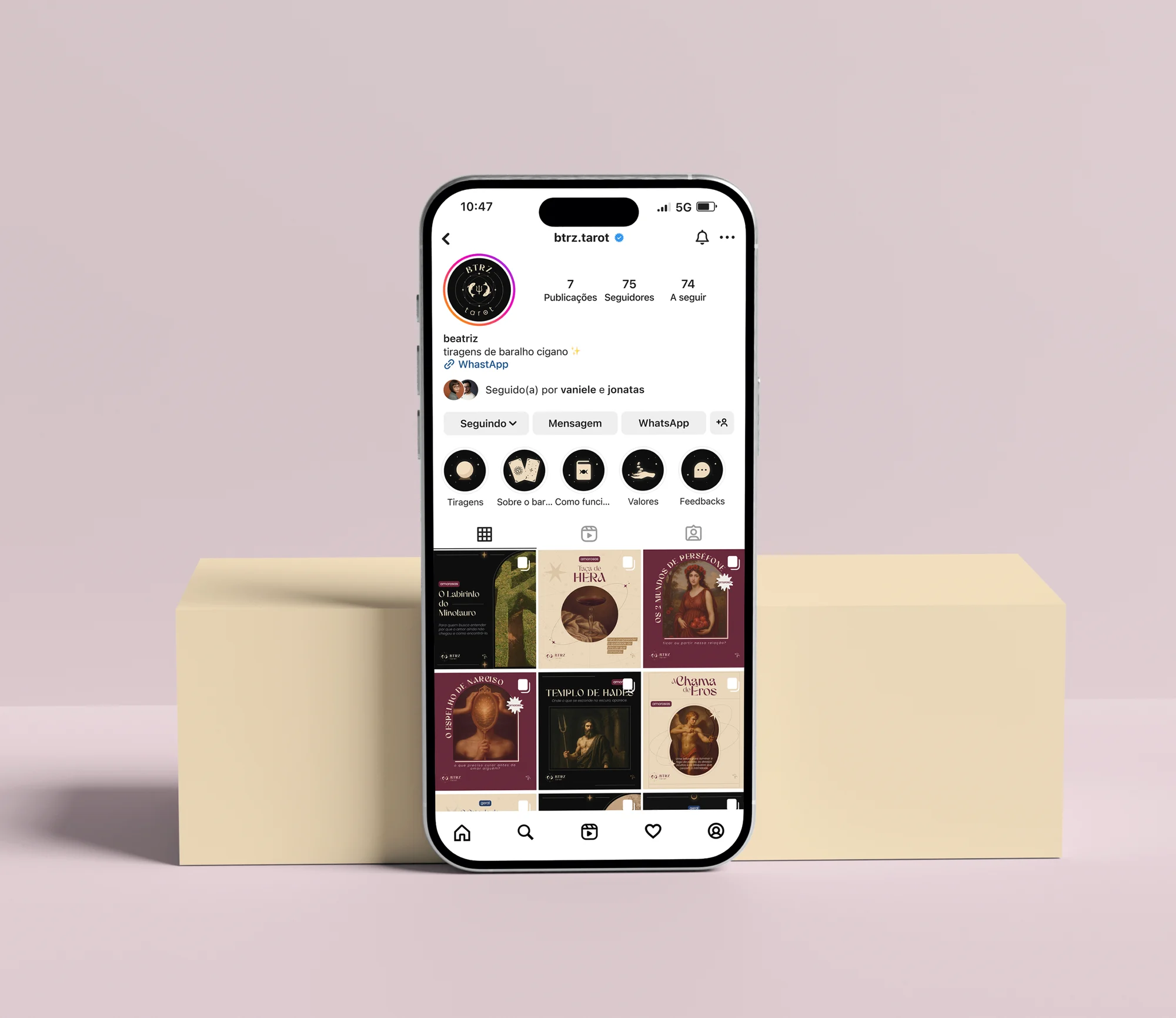
What we delivered
- Fully organized Google Drive
- Editable Figma files
- Visual identity and brand manual
- Print-ready stickers
She already knew what she wanted. She just needed someone who knew how to do it
Beatriz already had her method, her spreads and her clients, but not an identity that could support all of that visually.
So our challenge was to bring together the Gypsy deck and Greek mythology without losing the sophistication of either.
Tarot and Greek mythology in the same space
Tarot speaks through symbol and intuition. Greek mythology speaks through myth and classical form. They are two worlds with very distinct languages, and the risk of one swallowing the other was real.
So the risk was obvious: lean too far into the esoteric and lose elegance, or lean too far into the classical and lose spiritual depth.
That's why the balance between the two was the key point of the project.
We worked on three fronts to solve this:
Tarot speaks through symbol and intuition. Greek mythology speaks through myth and classical form. They are two worlds with very distinct languages, and the risk of one swallowing the other was real. So the risk was obvious: lean too far into the esoteric and lose elegance, or lean too far into the classical and lose spiritual depth. That's why the balance between the two was the key point of the project.
Symbolic narrative
Mythology as the basis for naming each spread and giving it depth, without forcing the reference.
A visual language of its own
An aesthetic that blends the classical with the symbolic: sober, refined and free of esoteric excess.
An organized service
The spreads structured as a real catalog, beautiful and functional, easy to understand and choose from.
Each reading became a product with its own identity
Name, symbolic concept, category and question structure, all designed so people understand what they are choosing before they even get in touch.
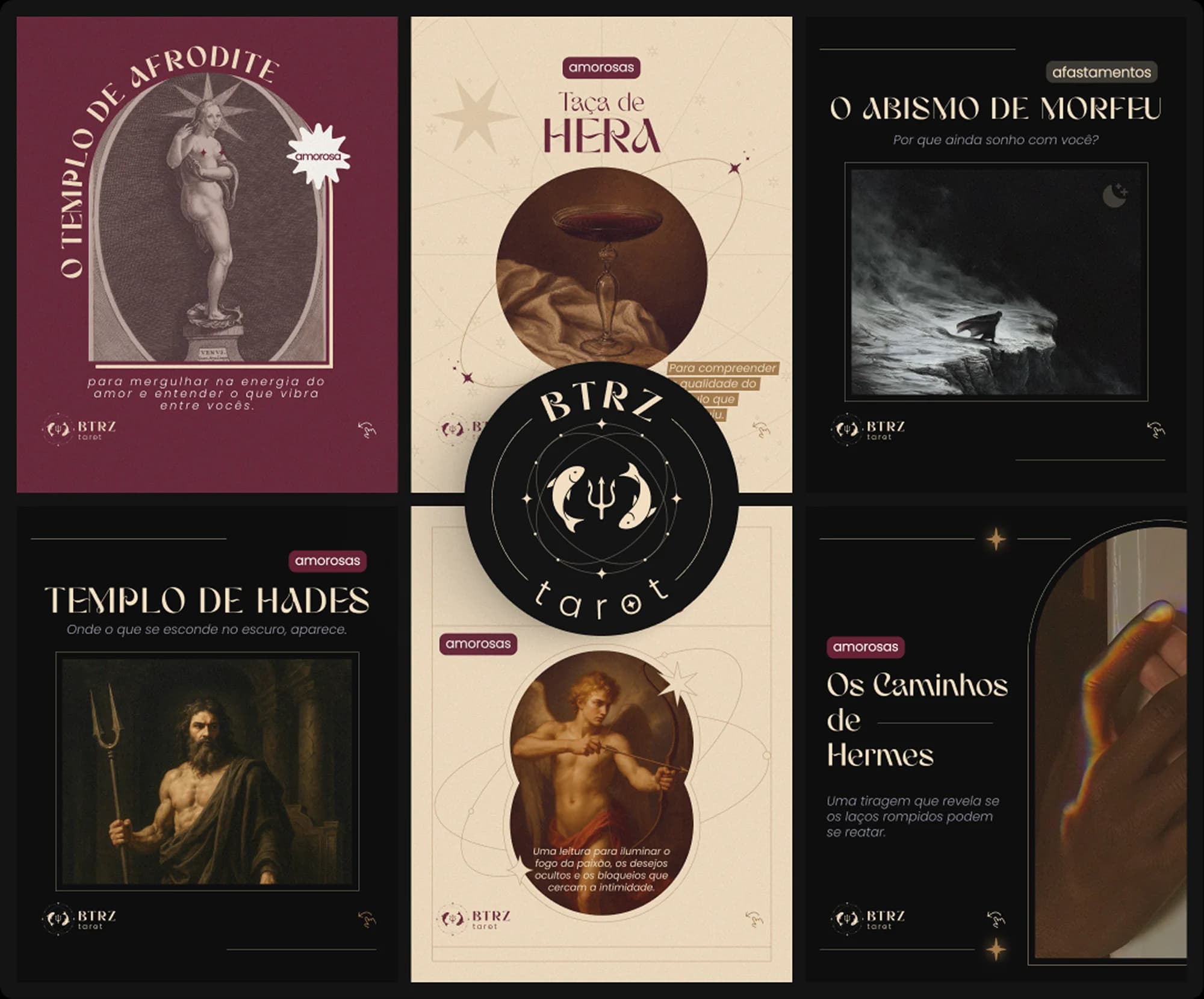
An aesthetic that feels like her
The logo was designed as a system of three complementary elements, each with a symbolic role within the BTRZ universe.
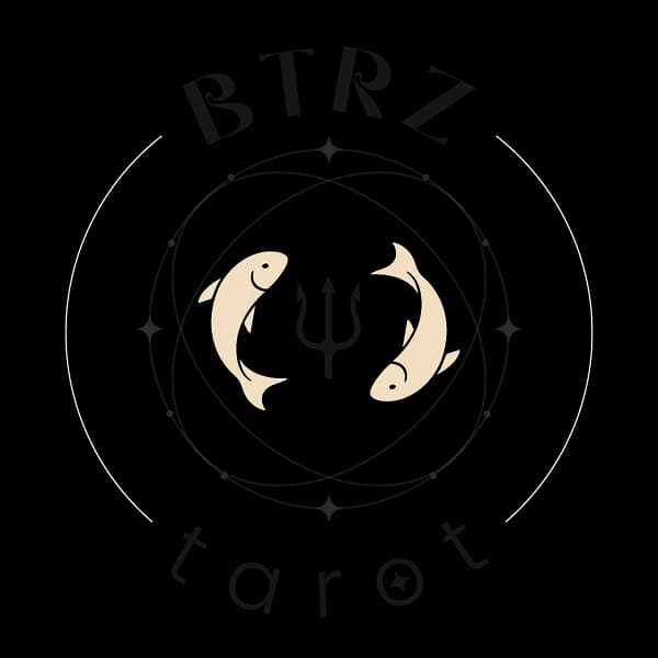
Pisces in orbit
Beatriz's sun sign. A personal reference that directly links the brand to who she is.
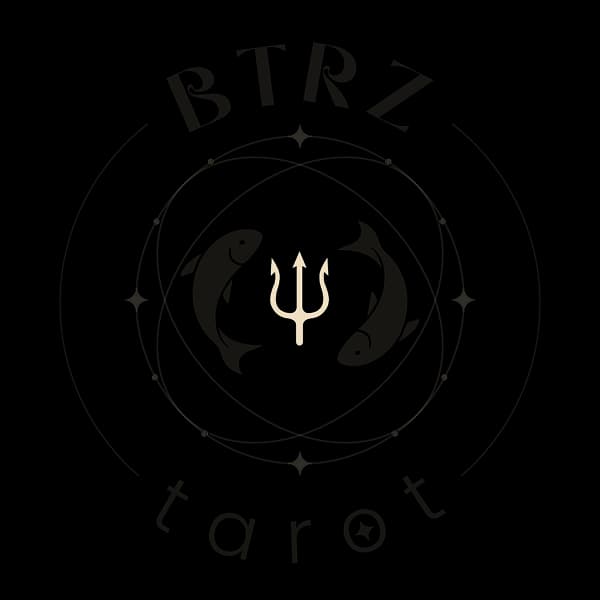
Poseidon's trident
Poseidon is the Greek god who rules Pisces, Beatriz's sign. The trident is the direct link between her and the brand's mythological universe.
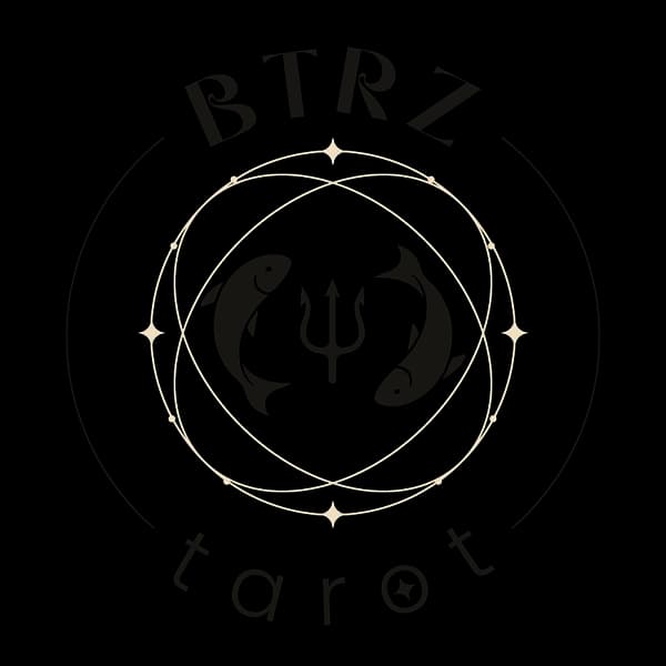
Stars and circles
They evoke the symbolic universe of tarot and the idea that each reading is a connection to something greater.
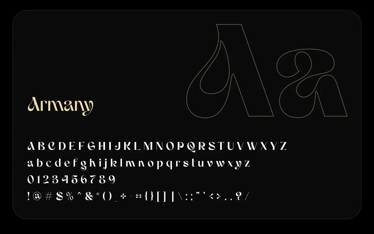
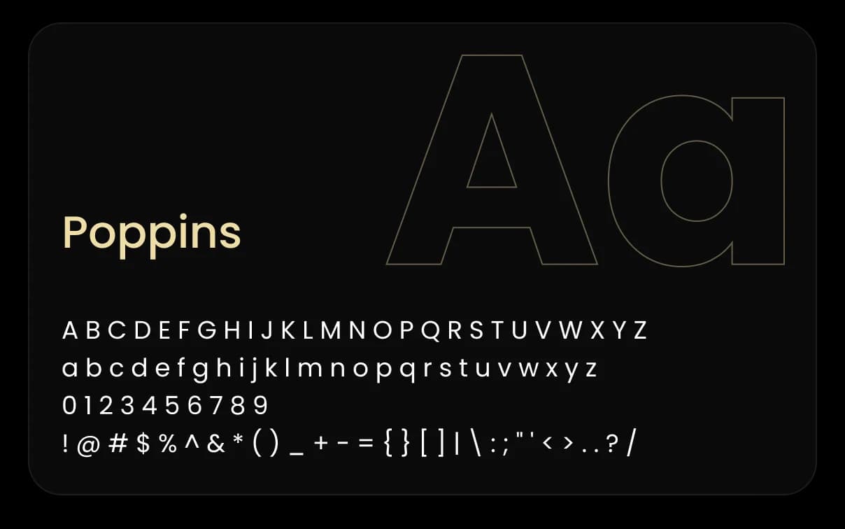
Two typefaces with different roles
The typeface choice followed the same logic as the brand: sophistication with mysticism and functionality working together.
Six colors, each with its own role
The palette was built to convey mystery without falling into the esoteric cliché.
Main colors
Secondary colors
Let’s talk
If you have a vision that needs to take shape with intelligence and precision, we’re ready to listen.
Clear next steps
After our conversation, you get a clear path: scope, timeline and investment to get your idea off the ground.
Fast response
We get back to you quickly. The listening, the strategy and the building, we do with care.
