Patrimune
Visual identity, UI/UX and website development for Patrimune, turning complex tax theses into clear, trustworthy communication that generates diagnosis requests.
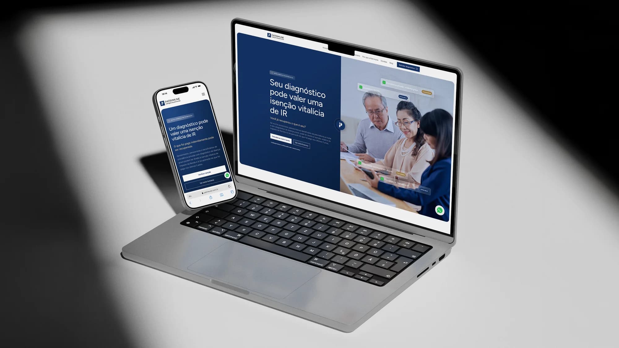
What we delivered
- Full website UX/UI in Figma
- Website + dashboard development
- Responsive layout
- SEO and performance
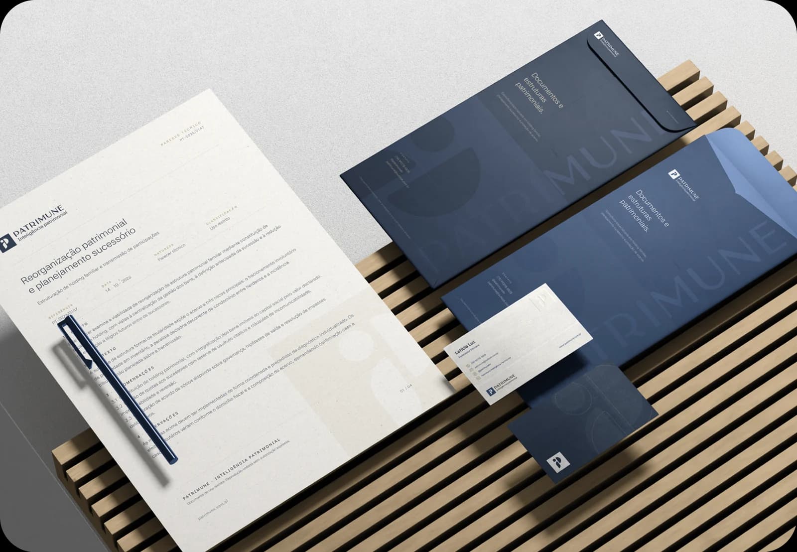
- Brand manual
- Visual identity
A right that exists, but almost nobody knows about
Patrimune is a tax and wealth intelligence consultancy that helps people with serious illnesses exercise a right provided by law, income tax exemption and refund of amounts paid unduly, while also working on asset organization, succession and inheritance tax (ITCMD). A technical and sensitive field that needed a digital presence to match.
How do you communicate something technical, sensitive and full of distrust?
The obstacle isn't a lack of rights, it's a lack of information: the law exists and Brazil's Superior Court of Justice has already recognized it, yet most people keep paying tax every month. The challenge was to translate complex tax theses into clear, trustworthy language, without jargon and without sounding like an easy promise, leading people to request a diagnosis.
Our strategy focused on clarity and trust:
Information architecture
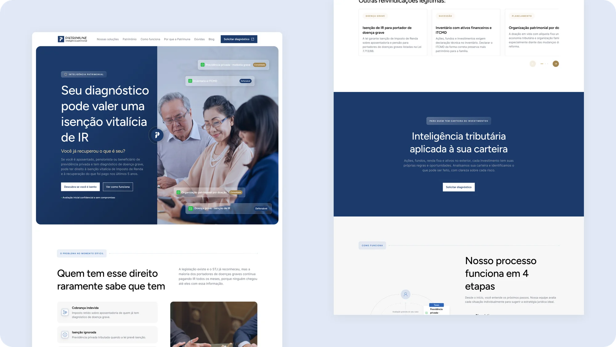
We organized complex theses and services into an understandable journey: first people learn they have a right, then they get to know the theses and, finally, they are invited to request a diagnosis.
UI/UX that conveys seriousness
A sober, sophisticated design that reinforces the consultancy's technical authority and treats a sensitive subject with the respect it demands.
A website built to convert
Responsive development with a clear CTA throughout the journey: a request for an initial, confidential, no-commitment diagnosis.
A digital presence that lives up to the consultancy
The website presents the tax theses clearly and rates each one by risk level, established, defensible or risky, reinforcing transparency. Each section naturally guides visitors toward requesting a diagnosis.
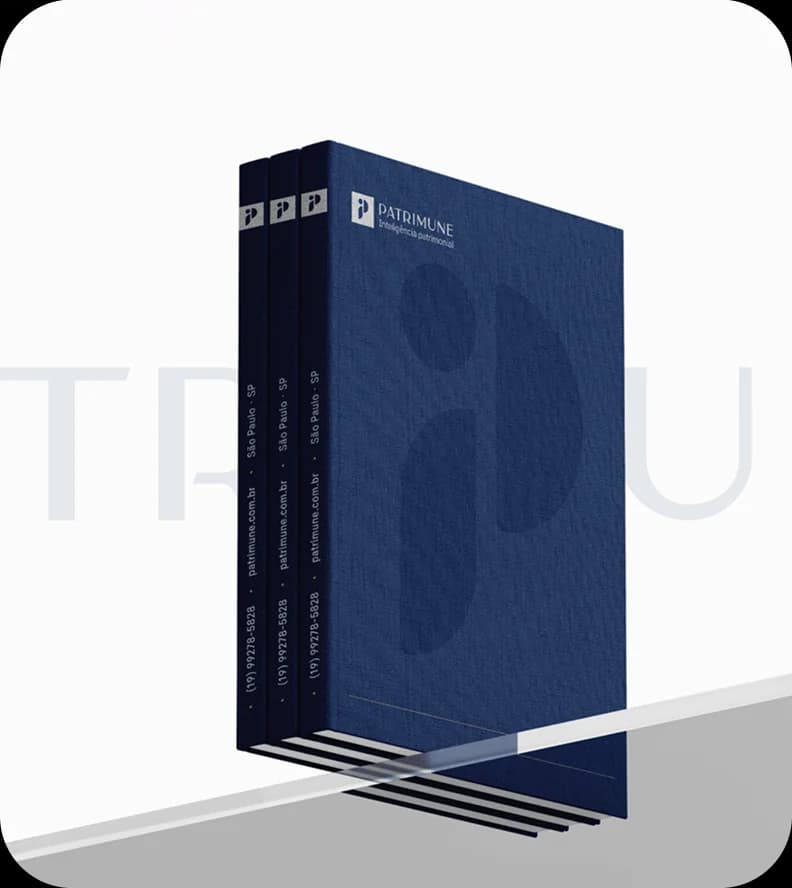
A sober brand for a sensitive subject
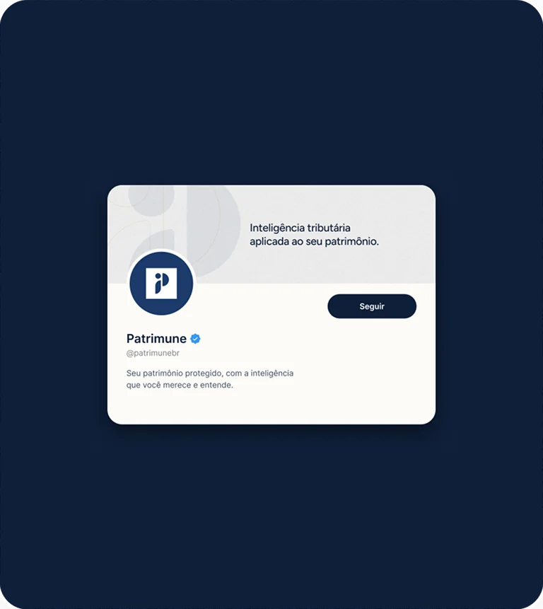
The identity combines a geometric symbol, a palette of deep blues with touches of champagne and gold, and custom lettering in the logotype, conveying the seriousness of a technical consultancy without losing the human touch.
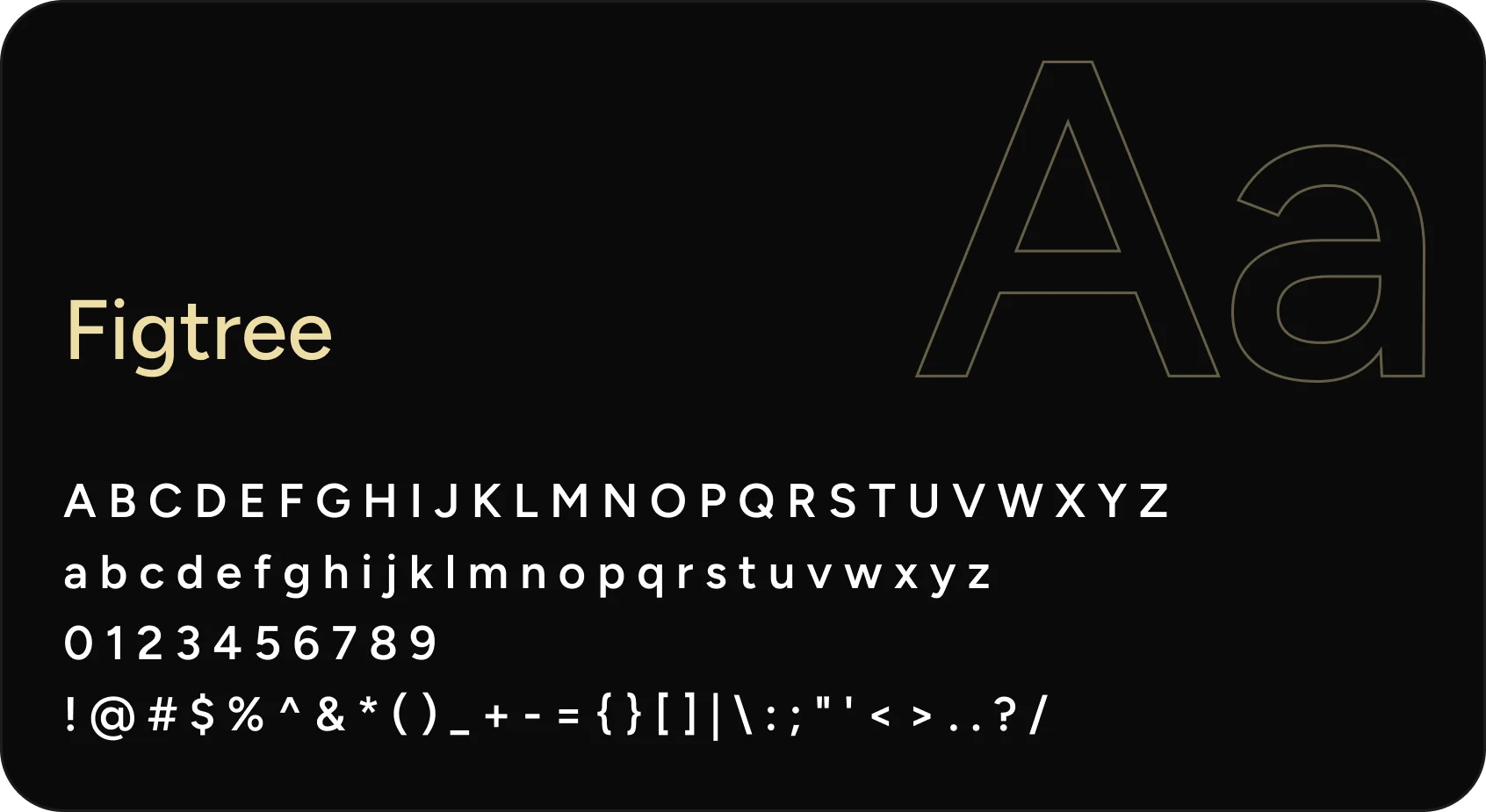
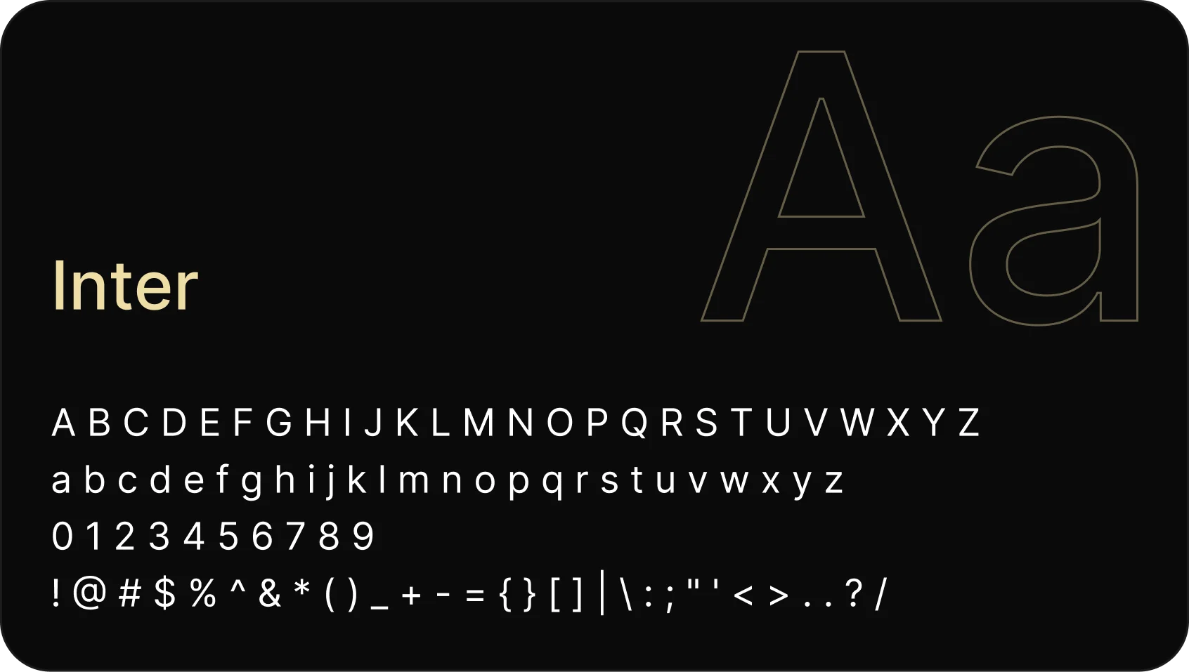
Two typefaces with different roles
On the website, the brand gives way to reading: one family structures the hierarchy, the other carries long-form text.
Patrimune's color palette
Main colors
Secondary colors
Let’s talk
If you have a vision that needs to take shape with intelligence and precision, we’re ready to listen.
Clear next steps
After our conversation, you get a clear path: scope, timeline and investment to get your idea off the ground.
Fast response
We get back to you quickly. The listening, the strategy and the building, we do with care.
