Realizar Empreendimentos
A new visual identity and brand manual for a company with 27 years of history that needed a brand to match everything it had already built.
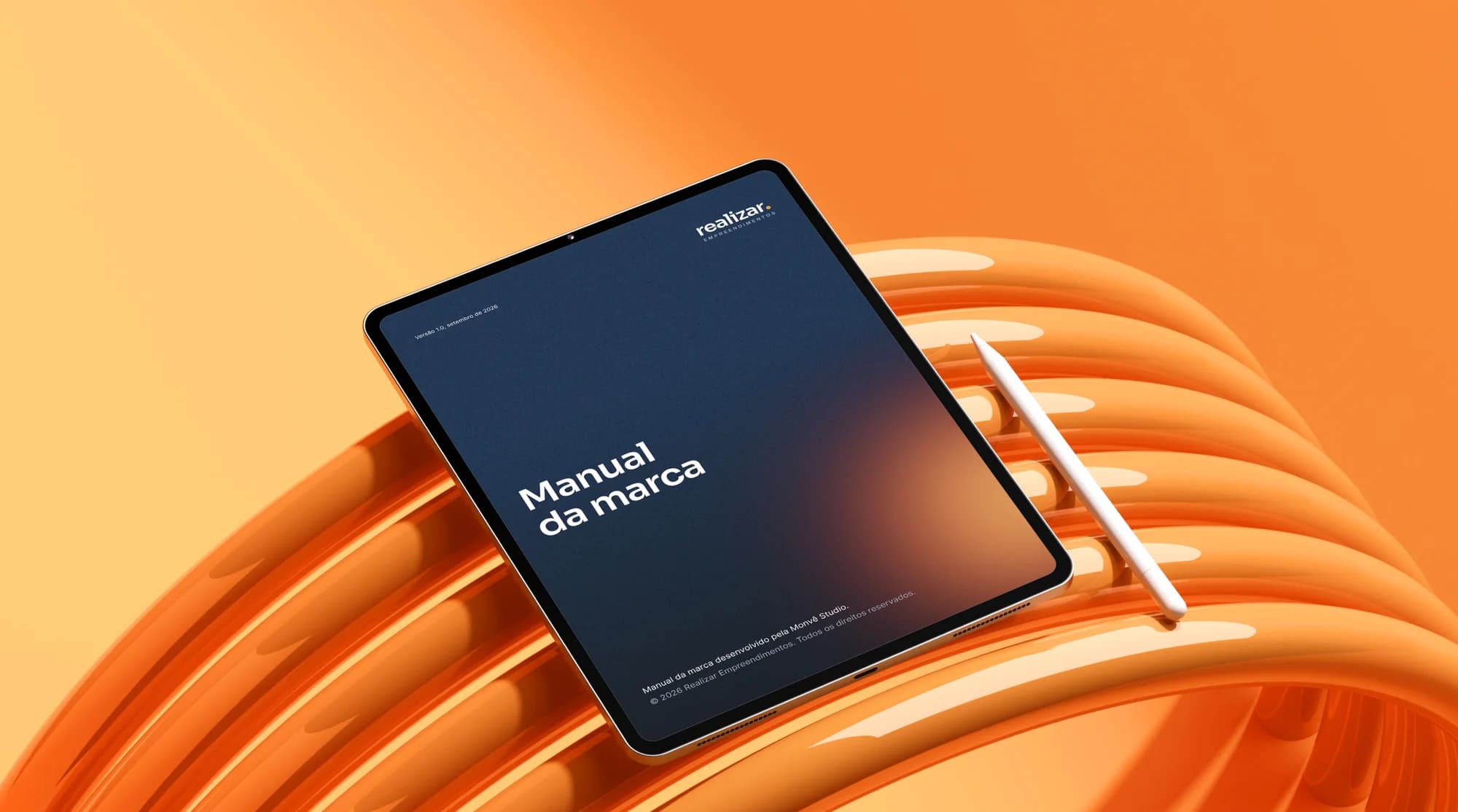
What we delivered
- Visual identity and brand manual
- Stationery, badges, uniforms and fleet
- Email signature
- Editable Figma files
27 years of history and a brand that hadn't kept up
Realizar Empreendimentos was founded in 1999 in Santana de Parnaíba, and for 27 years it has brought value-added products and services to end consumers, with long-term partnerships and agreements across several Brazilian states.
The company had history, a customer base and a presence in several states, but not a brand that could support and keep up with all of that.
How do you look current without erasing almost three decades?
With almost three decades in the market, Realizar was automatically read as a traditional, conservative company.
The challenge was to rebuild the entire identity, from signature, colors and typography to usage rules, bringing comfort, empathy and modernity without losing the heritage of the previous logo.
We worked on three fronts to solve this:
Before designing, we defined what the brand needed to say: that Realizar has history, but speaks to today's customer.
A verb as a brand
“Realizar” (to achieve) is a verb in the infinitive. The orange dot closes it and turns the verb into a statement, and it is also a legacy of the previous logo.
Approachable, without losing experience
Lowercase letters bring comfort, empathy and modernity at first sight, with an experienced, direct and approachable personality.
A manual for everyday use
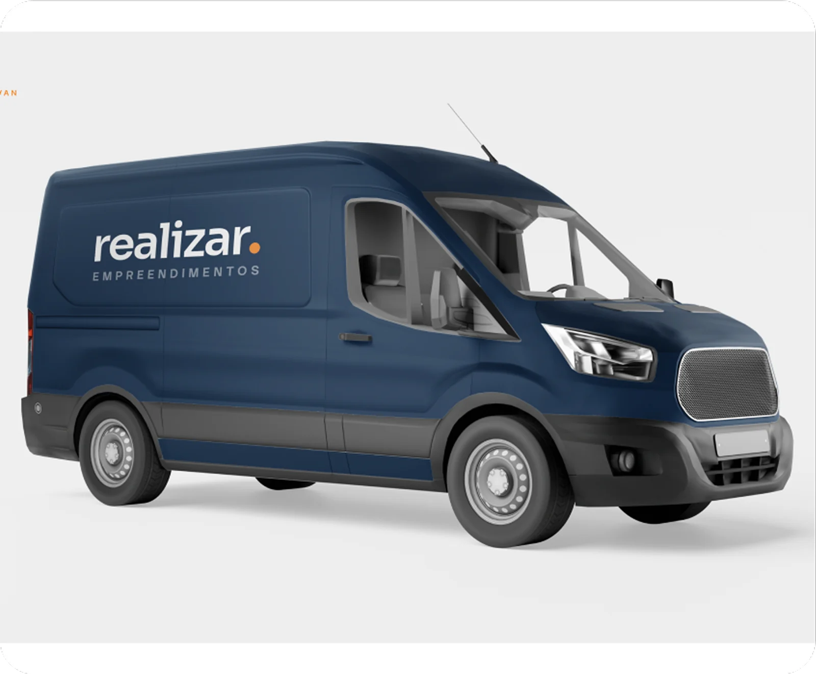
Colors, typography, graphic elements and applications documented so the brand always looks the same, from letterhead to van.
A brand that looks the same everywhere
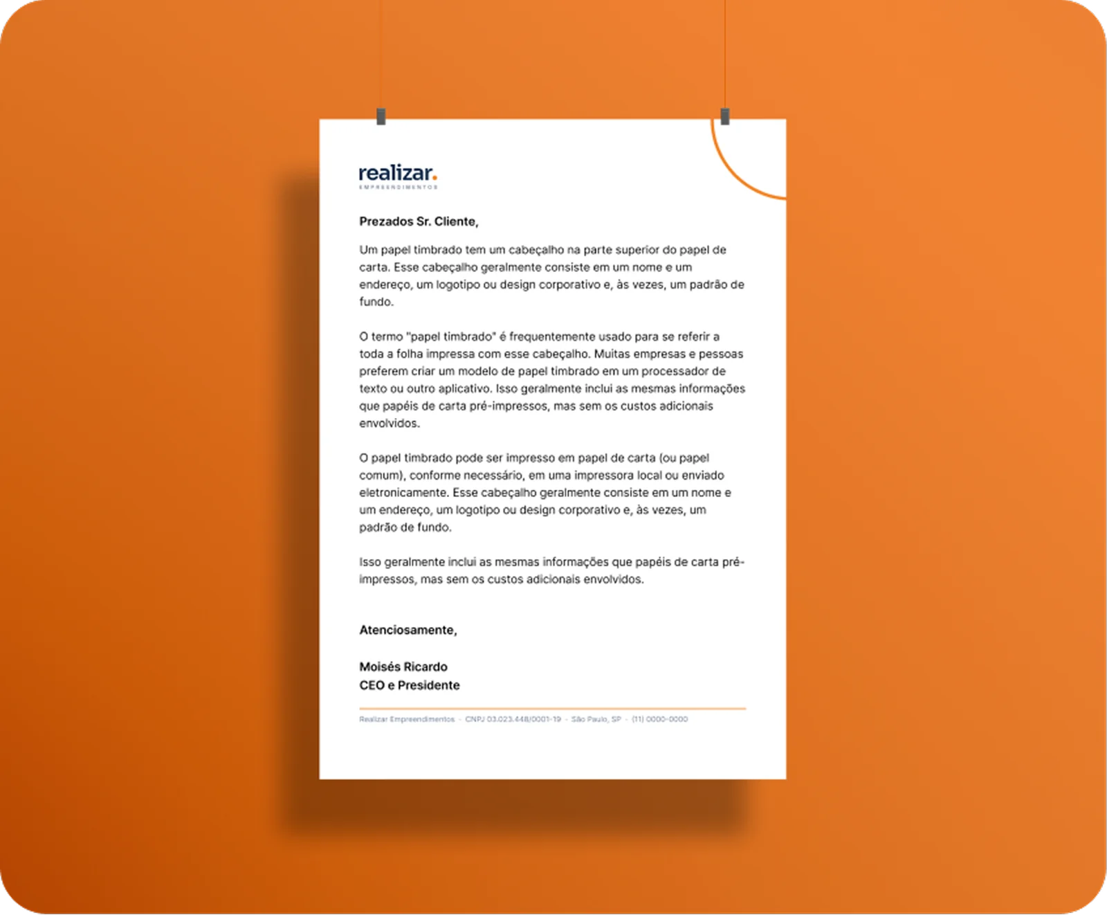
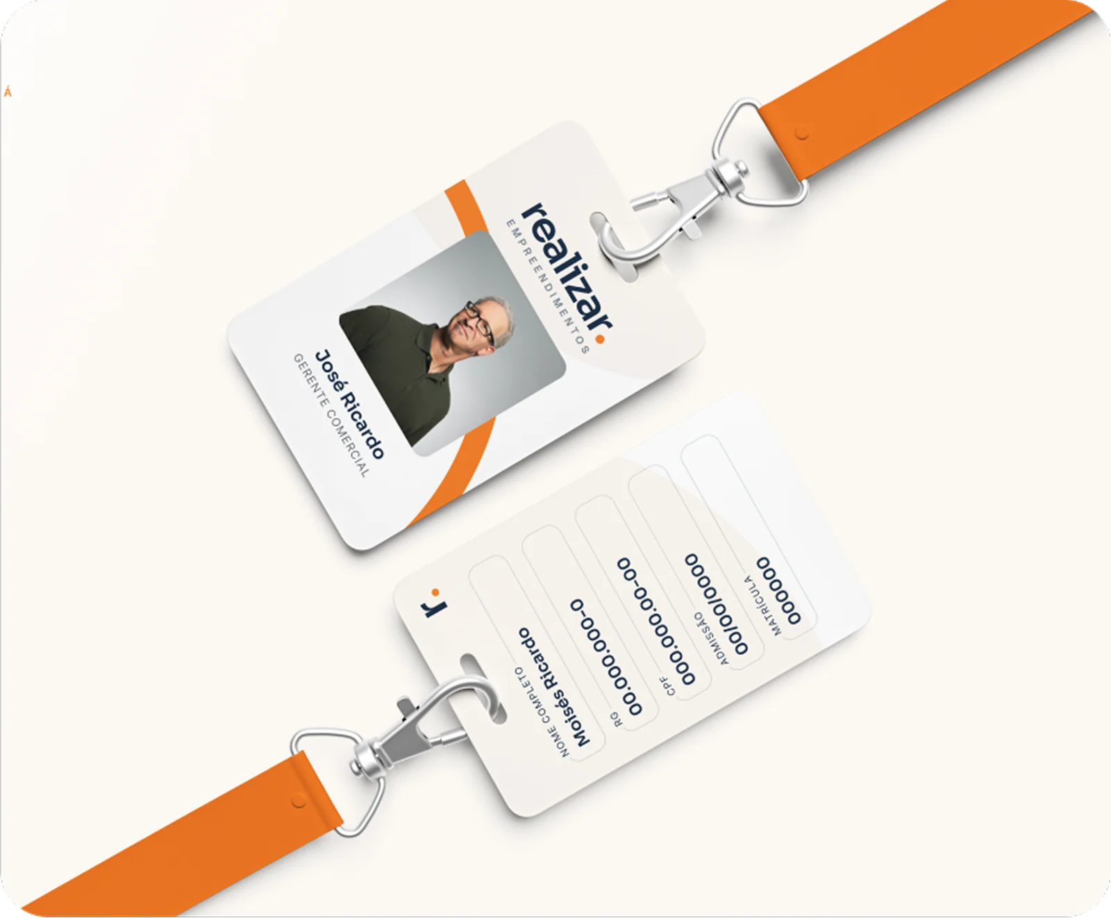
Letterhead, business card, badge, uniform, van and email signature all follow the same color, typography and clear-space rules.
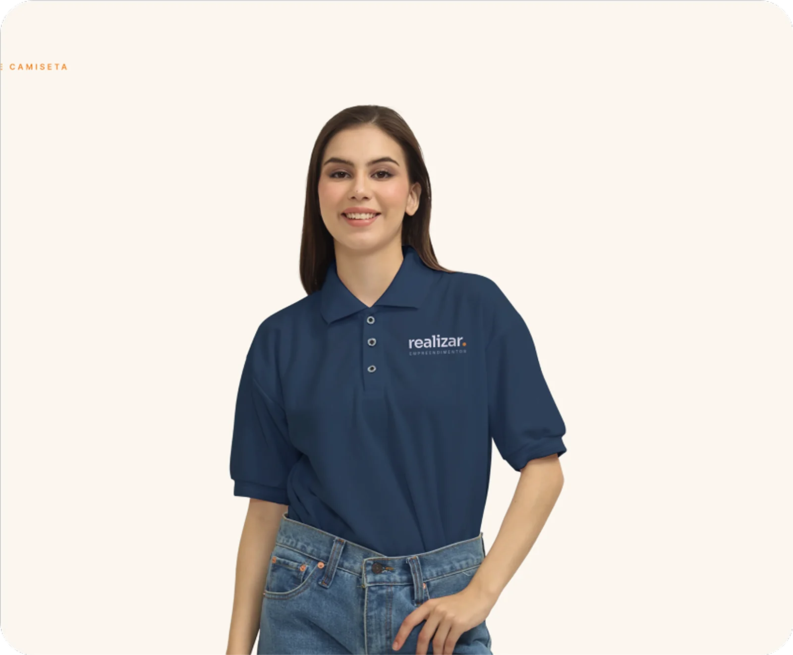
Three pieces that keep the brand present
The signature unfolds into elements that keep Realizar present even when space is tight or the full brand doesn't appear.

Main signature
The lowercase wordmark with the orange dot. It is the default for letterhead, badges, presentations, email and documents.

Compact mark
The “r.” on its own, for when the full signature doesn't fit: avatar, favicon, app icon, stamp and small embroidery.

The arc
Drawn from the shoulder of the “r” turned into a quarter circle. It appears large and cropped by the edge, so the brand is present even if subtly.
Two typefaces with different roles
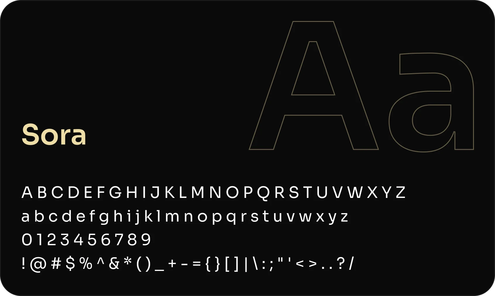
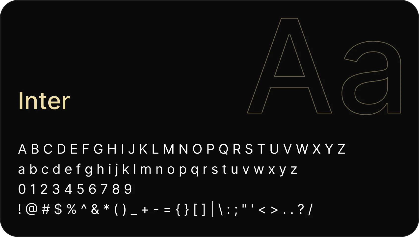
Sora for headings, with weight and personality, and Inter for body text, for legibility at any size.
Three colors, each with its own role
Two main colors and a third supporting one. Orange is reserved for highlights and graphic elements, never for text.
Main colors
Supporting color
Let’s talk
If you have a vision that needs to take shape with intelligence and precision, we’re ready to listen.
Clear next steps
After our conversation, you get a clear path: scope, timeline and investment to get your idea off the ground.
Fast response
We get back to you quickly. The listening, the strategy and the building, we do with care.
