TuaVita
We completely redesigned the product's digital presence: website UI/UX and development, a sales deck and consulting on the white-label app rollout.
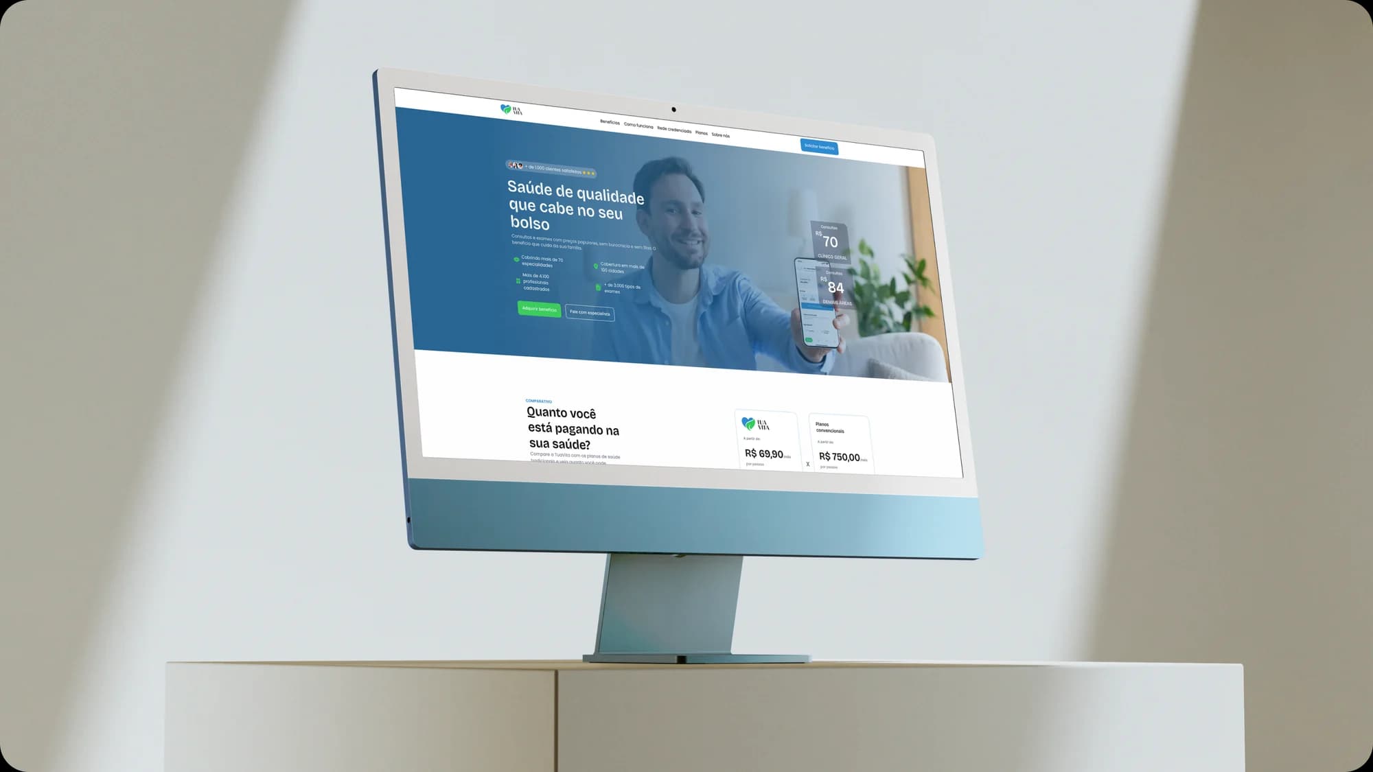
What we delivered
- Full website UX/UI in Figma
- Website development
- Responsive layout
- RD Station integration
- Sales deck in Canva
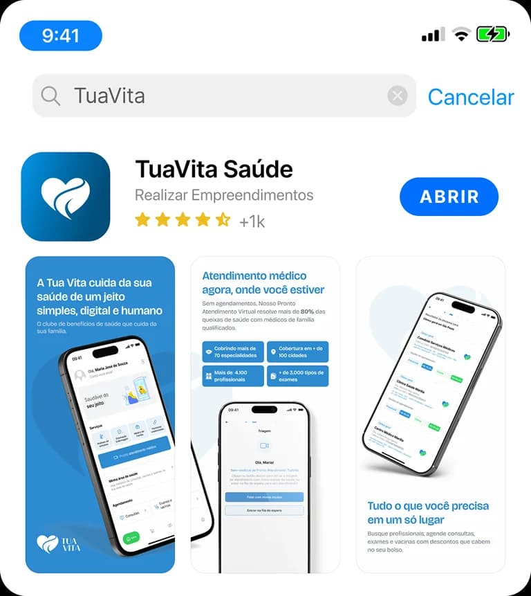
- App Store and Google Play artwork
- App implementation consulting
- SEO and performance
The product changed and the website had to keep up
Tua Vita went through a major transformation: it stopped being a health card aimed at companies and HR and became a monthly benefits club for individuals. It was a new product with a new audience, and the old website said none of that.
The job was to build, from scratch, a digital presence that made sense to the person on the other side: someone who needs quality healthcare but can't afford a health plan.
How do you talk about healthcare to people who have given up trying?
The audience Tua Vita wants to reach knows the pain well: an overcrowded public health system, health plans that cost too much, long waiting periods, absurd contracts. These are people who have tried and failed, or who simply never had access.
The challenge was to translate a technical product, born in the B2B world, into accessible and direct language, without oversimplifying, without losing credibility and without sounding like yet another empty promise in healthcare.
Our strategy was split into three stages:
A B2C website from scratch
Architecture, UX, UI and full development: responsive, integrated with RD Station and designed to convert.
Sales deck
A corporate deck that presents the product, the market landscape and the plans in a clear, visual way.
App consulting
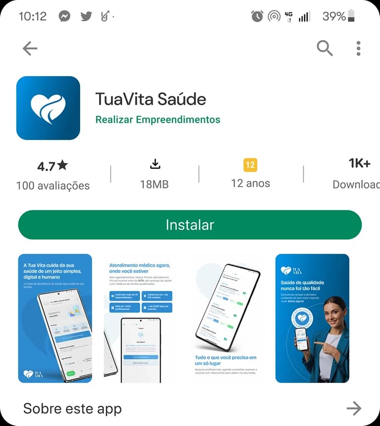
Support in rolling out Doutor123's white-label app and creating the store artwork (App Store and Google Play).
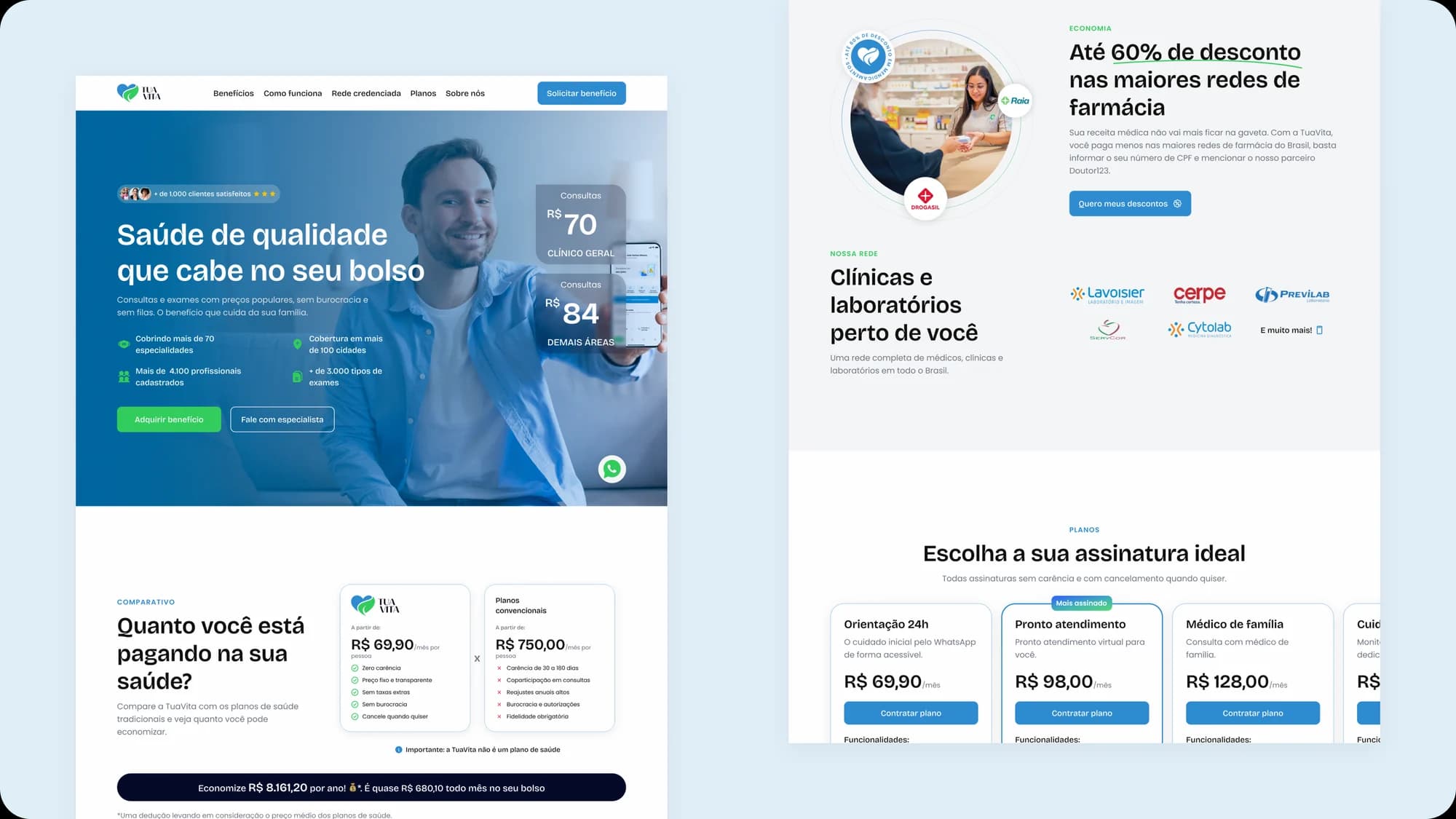
A page that explains and converts
The website was built around a journey: first people recognize the problem, then they understand the solution, then they see the plans and get in touch. Each section has a clear role in that flow.
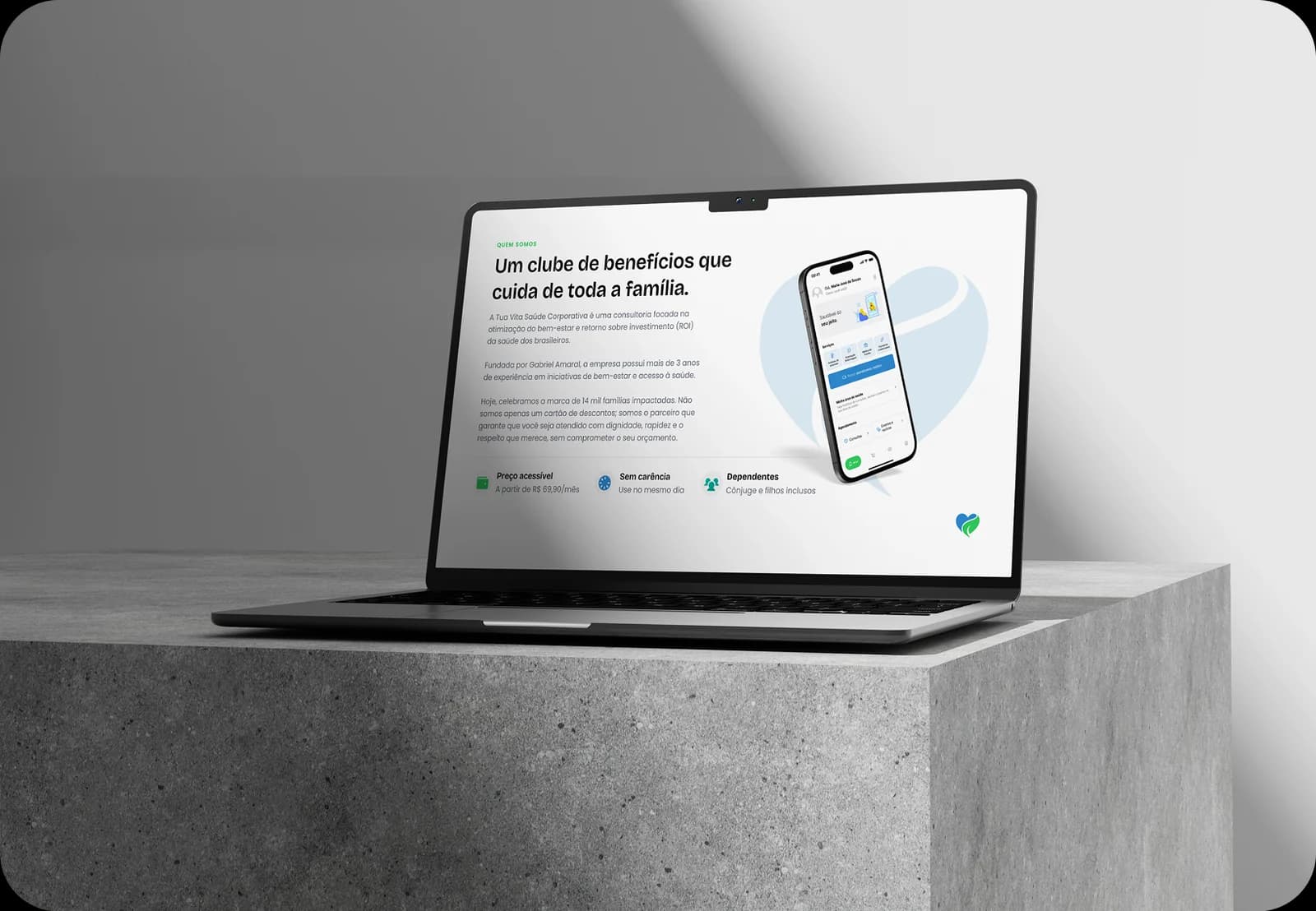
A deck that presents the product clearly
The sales deck was built to cover the market landscape, Tua Vita's proposition, its services and plans — in a visual, direct way designed for the sales context.
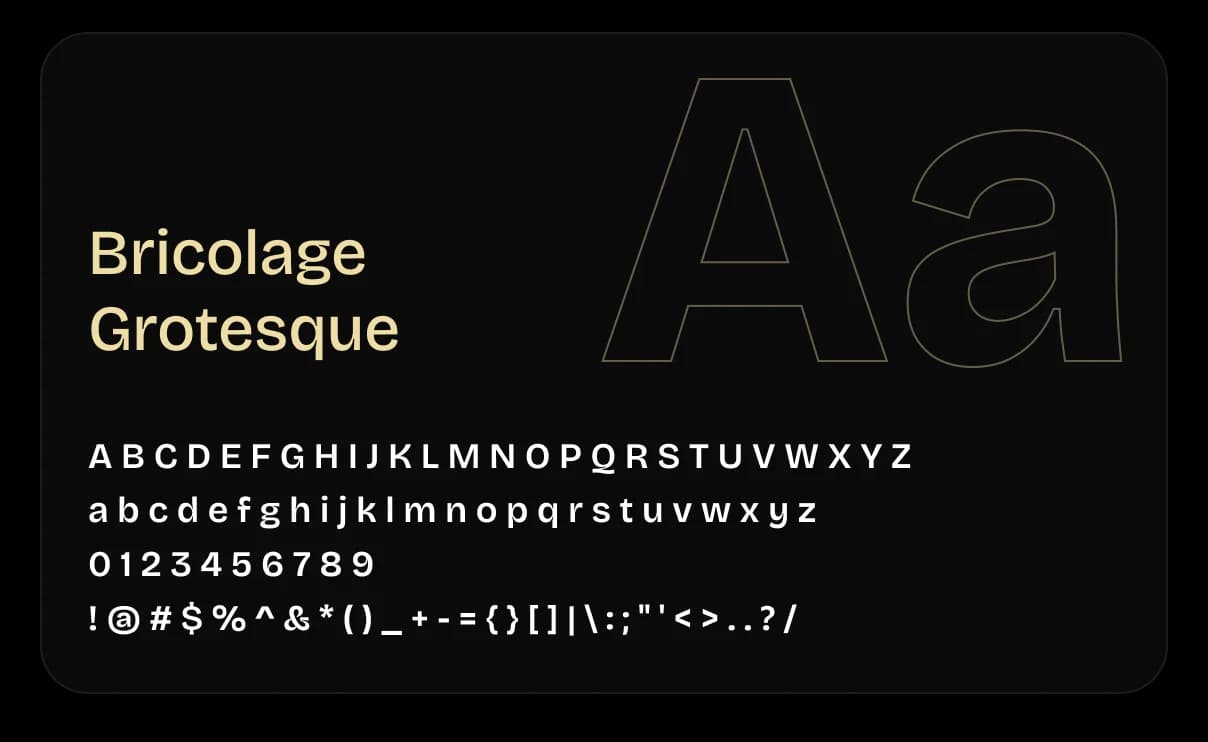
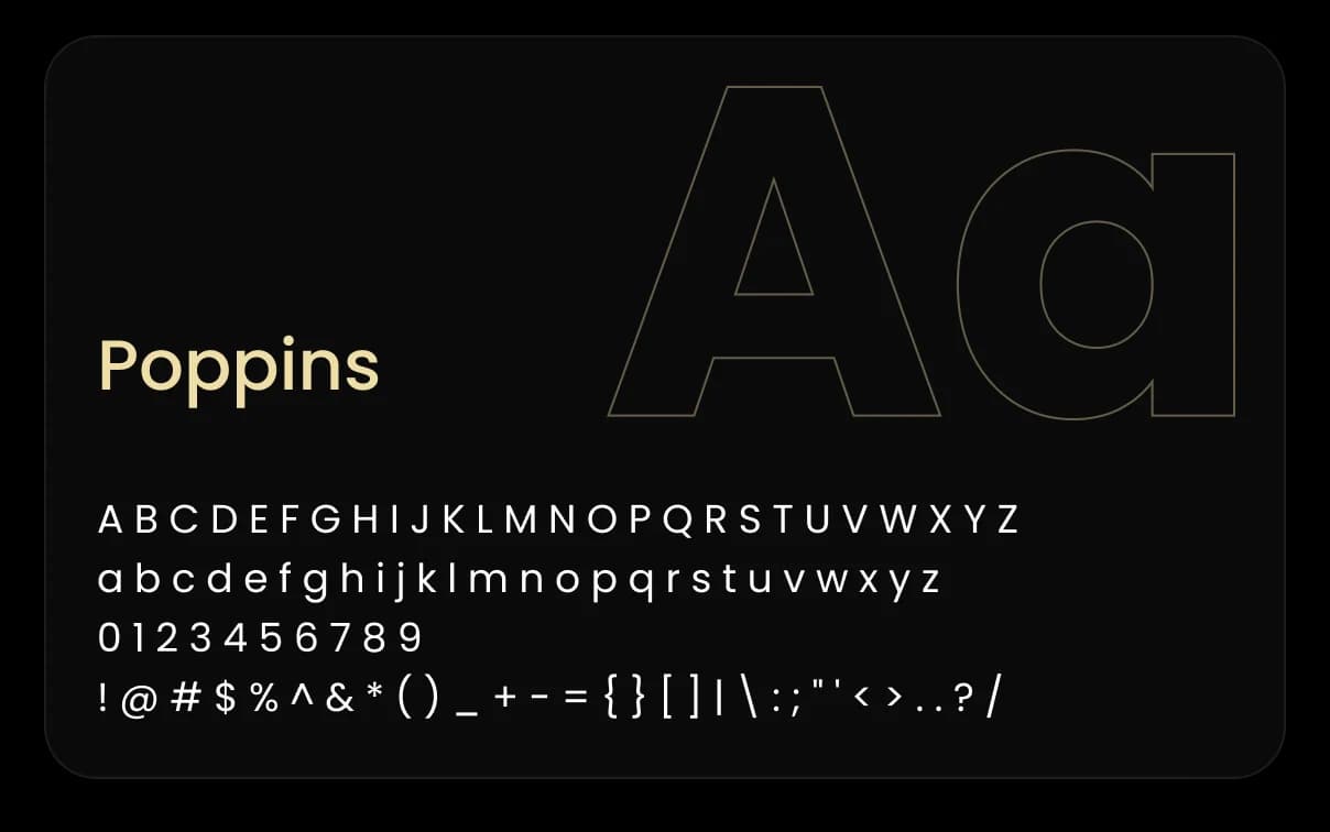
Two typefaces with different roles
The typeface choice followed the same logic as the brand: sophistication with mysticism and functionality working together.
TuaVita's color palette
The palette was built to convey mystery without falling into the esoteric cliché.
Main colors
Icons chosen to support the brand's communication
Let’s talk
If you have a vision that needs to take shape with intelligence and precision, we’re ready to listen.
Clear next steps
After our conversation, you get a clear path: scope, timeline and investment to get your idea off the ground.
Fast response
We get back to you quickly. The listening, the strategy and the building, we do with care.
